Home>Portfolio>ClearView Branding

Case Study: ClearView Branding

Drone photography, videography assessment, and surveying services

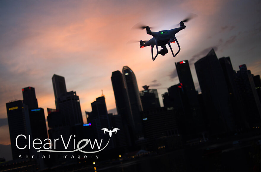
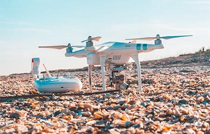
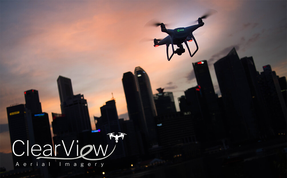
ClearView Aerial Imagery is a revolutionary drone photography business, deeply seated in the new UAS industry that uses drones to capture aerial cinematography that in the past has been difficult, expensive, unsafe, or completely unobtainable until now. They offer recreational, commercial and industrial drone photography services for special events, weddings, real estate, agriculture, terrain mapping, UAV and emergency situations.

The Challenge

This startup had been shopping around for a fresh new logo for their aerial imagery company, and after several months, they still did not have a workable design.

Most importantly, these other designers had been following boiler-plate design trends without any consideration for what industry ClearView might be. If ClearView opted for one of those designs, it would have been impossible for anyone to guess what ClearView actually did.

Our Solution

A crisp, modern design that captures elements of the aerial photography industry. This bespoke design would aim to take ClearView’s branding to new heights. 

Research & Process

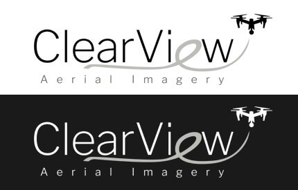
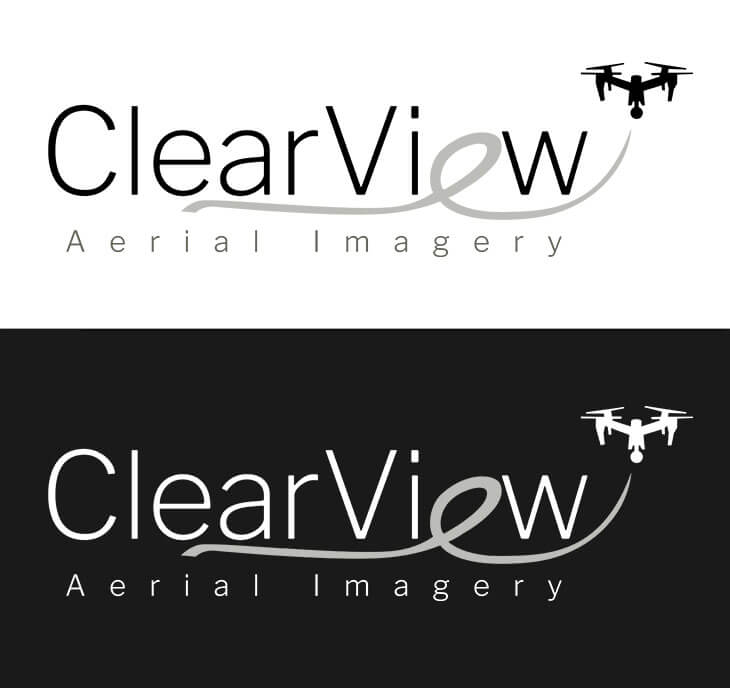
We discussed the desired aesthetic of what the ideal logo for ClearView might be. Clean and modern, this logo would need to work on a variety of backgrounds. Given that ClearView would largely operate in a civilian commercial setting, the branding needed to be approachable. 

With this in mind, our creative team began by conducting a sweep of fonts that felt appropriately sleek, yet not overly sterile. We homed in on fonts with narrow variants; the design would be airy, lightweight. 

It was important to ClearView that the logo contain the silhouette of a drone. During the design process, our team envisioned replacing the second ‘e’ of ClearView with an illustrated swooping cursive-style lowercase e. This shape would then serve as an underline, but more crucially, as the trailing flight path of a drone.

As with many aspects of life, balance would be key. Clean yet friendly, modern yet progressive… at the crossroads of it all, ClearView set its tone.

Results


  • Elegant design work, paired with the flowing path of a drone with crisp, angular letterforms to create beautiful synergy. 
  • A buoyant design that would help take ClearView to new heights.
  • A versatile set of logos for all intended use cases. 

Client

ClearView Aerial Imagery

Industries

Project Scope

Branding, Logo, Graphic Design

TESTIMONIALS

Kind Words From Our Clients & Peers​​

We’ve had the good fortune of meeting many amazing people in this industry. Here’s what they’ve had to say about us.