Home>Portfolio>AeroVenture Branding &#...

Case Study: AeroVenture Branding & Website Overhaul

Inspiration through aviation and aerospace education.

AeroVenture’s passion for aviation shines and motivates. As instructors, they maintain a strong focus on cultivating the next generation of skilled aviators and aerospace pioneers. To achieve this goal, AeroVenture has forged pivotal partnerships with colleges, high schools, nonprofits, aerospace industry leaders, and airlines.

The Challenge

A change of market and a desire to stay modern called for an update to both logo and website.

Our Solution

Capture the target market with appropriate styling. Their industry peers tended to focus on being cut-rate, expedient, and casual. In defiance of that trend, AeroVenture strove to project a sense of luxury. Prospective students might be looking to switch careers and become a pilot professionally, or they might choose to fly for the joy of mastery. In either case, both markets would benefit from a school which focused on safety and quality training over haste and expediency.

Research & Process

While the earlier logo was designed to invoke the golden age of flight, the new brand would represent simplicity and modernity. We sought inspiration from outside the aviation industry, looking at luxury-brand automobile companies and their representation of their brands. Clean lines and a slight gradient bestow the logomark with refreshing elegance, while the increased tracking of the characters allows space for the text to breathe.

Knowing this logo would be used on multiple surfaces and materials (signage, uniforms, flyers, etc.), it was crucial that the design be legible at both the small and large scale.

The majority of the site content required a complete overhaul. Many new pages and categories were crafted, while existing pages were fleshed-out or combined to offer the best reading experience. The layouts themselves were expanded: incorporating bold new imagery, helpful icons, and interactive data visualization. Between creating a logical site navigation and maintaining a clear visual hierarchy on each page, Cosmic Designs improved the site experience for any visitor to the site.

The largest hurdle was cultivating the site text itself. The client had plenty of information on its original website, yet it lacked a clear voice. As this new site would project both luxury and modernity, it was important to provide context while shying away from too much jargon.

One thing we regularly saw during our research phase was the overwhelming amount of inaccessible, impenetrable walls of aviation jargon. Combined with so-called “alphabet soup” of acronyms, many businesses were creating barriers between themselves and prospective clients.

Striking that balance — retaining that human element — while still being clear about what each step of becoming a pilot would entail proved to be quite the challenge. Ultimately, Cosmic Designs overcame this obstacle and wrote beautiful site copy.

Results

  • Ranked the nation’s best flight training school twice: In 2015, and 2019.
  • Secured partnerships with several airlines.
  • Successfully balanced markets (leisure and professional).
  • Increased brand recognition

Client

AeroVenture

Industries

Project Scope

Branding, Logo, Web Design, Web Development, Print Media, Uniforms

TESTIMONIALS

Kind Words From Our Clients & Peers​​

We’ve had the good fortune of meeting many amazing people in this industry. Here’s what they’ve had to say about us.
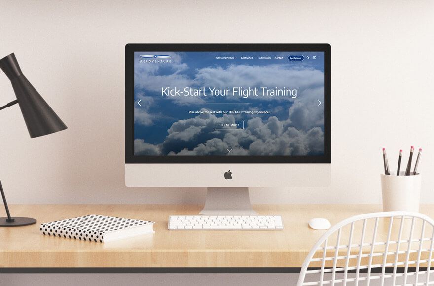
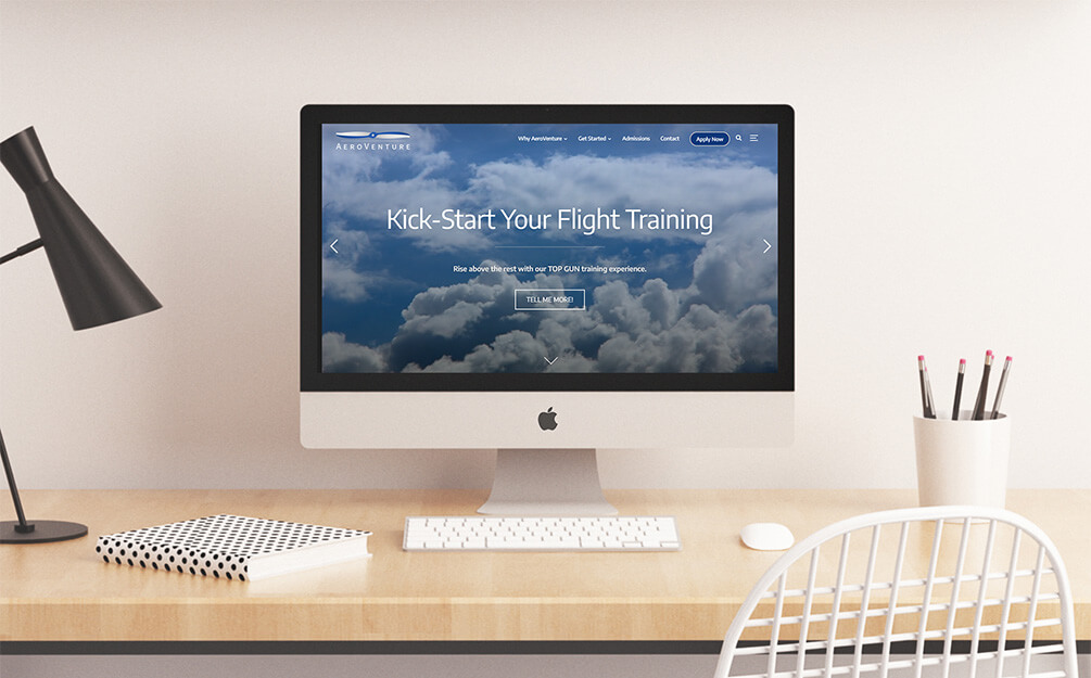
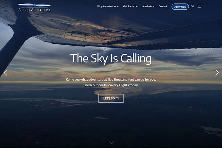
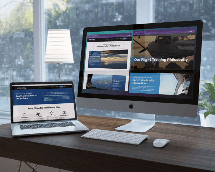