Portfolio
Our Recent Aviation & Aerospace Projects
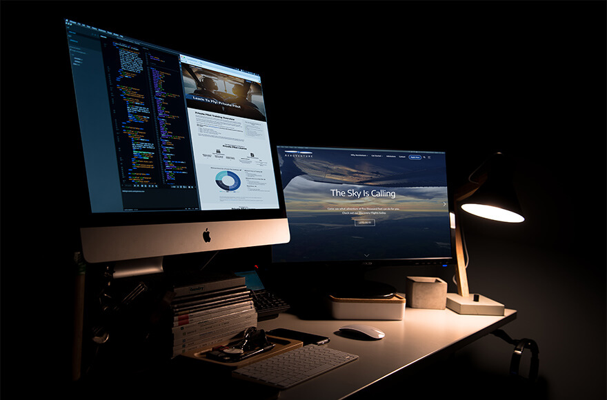
We've crafted web experiences that wow, for aviation companies and organizations of all sizes. Take a look at our case studies, and start dreaming big with Cosmic Designs.

Aviation is a booming industry. Whether you’re looking for career students, leisure students, or want to woo new CFIs, your web presence needs to be on-point.
What do your potential students see when they find your website? How many clicks does it take for them to find your contact information?
Start generating more leads with an eye-catching website that sets you apart from the flight school flock.
No two flight schools are alike. A generic experience might be better than no experience, but a bad website can turn away customers or job-seekers before they even speak to your wonderful staff.
Start thinking about your flight school’s website as the first point of contact – the first virtual handshake with your potential students. If navigating around your site feels clunky and awkward, these prospective students might begin to wonder about the type of service they can expect from your instructors.
How does your website look when viewed on their phones or tablets? Most people browse the web on their mobile devices, and your website might not have been built with smaller screens in mind. If it’s the first time they are interacting with your brand, a jumbled website will come off as unprofessional. Worse, it could even be seen as a red flag: What else has been overlooked?
Impress your potential students with a sharp, easy-to-navigate, mobile-friendly website.
Social media can be a great place to share updates, but remember: Facebook is designed to distract readers with other ads for other companies. On social media, you aren’t merely competing with other flight schools: You’re competing with celebrity click bait, cute photos of pets, memes, and all sorts of virtual chaos.
Plus, you are at the mercy of Facebook’s robots. Weird things happen all the time on Facebook – if you get locked out of your account, or if your company page gets banned, you might lose access to ALL that beautiful content. Woosh, gone.
Don’t keep your flight school’s eggs in one basket – keep them safe and secure on your own, lovely website.
Does your flight school’s brand need a refresh? No problem! Our team of creatives will fold in any branding changes to your new website.
We've crafted web experiences that wow, for aviation companies and organizations of all sizes. Take a look at our case studies, and start dreaming big with Cosmic Designs.
We’ve had the good fortune of meeting many amazing people in this industry. Here’s what they’ve had to say about us.
George is a very dedicated and talented individual with excellent interpersonal and entrepreneurial skills. I highly recommend him for any business opportunity or collaboration. George is one of the highest quality people that I have encountered during my 30 year career.
Kim has the ability to see projects holistically. She is someone that demonstrates high attention to details. She is very consistent in her executions and is able to perform her job regularly at a high standard. She is very knowledgeable and is way beyond her years in her career. She is always a pleasure to work with and is always kind.
I worked with George during my time with the Aircraft Owners and Pilots Association. He is a savvy businessman who is passionate about aviation and the clients he serves. George is great to work with and I look forward to continuing our relationship in future aviation projects.
Do you have a project in mind? We love creative collaborations both large and small.
Get in touch today!
10 Dorrance Street, Suite 700 | Westminster Square | Providence, Rhode Island 02903 | Planet Earth, Orion Arm of the Milky Way Galaxy.
© 2026. All rights reserved.